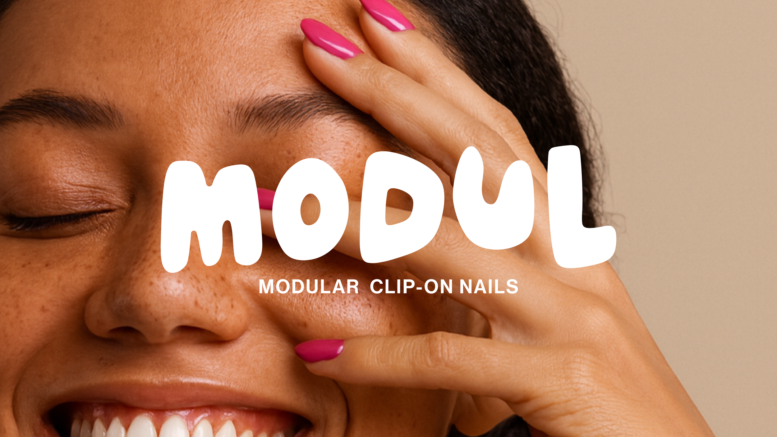
Modul
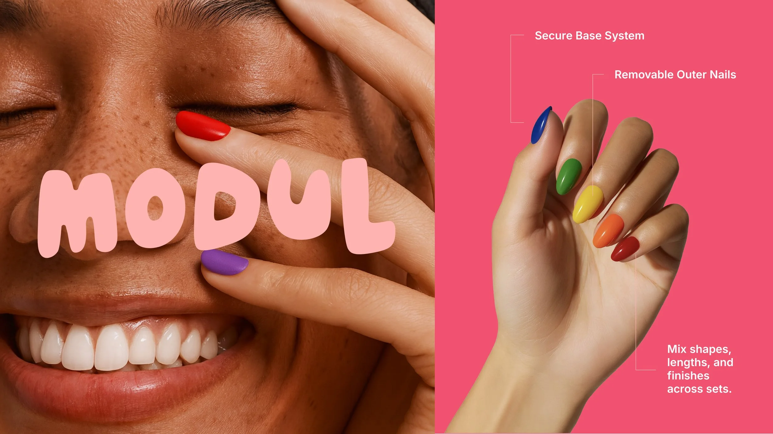
Modul is the next evolution of nails. Not a brand, a system. A clasp-based nail architecture where pieces clip on and off — secure when you need them, gone when you don’t. The brand had to mirror that same modularity: interchangeable, intelligent, and built for evolution..
-
The nail category has long been split between two extremes:
Salon acrylics and gels: Expensive, time-consuming, and damaging to natural nails.
Press-ons: Affordable and fast, but often flimsy, limited in customization, and still stigmatized as “temporary.”
The market lacked a solution that combined convenience, adaptability, and performance. The challenge was not only to introduce a disruptive product but also to create a new category—convincing consumers that nails can be both high-function and high-fashion, without compromise.
-
approached Modul as more than a beauty product—it’s a system. The positioning emphasizes innovation, adaptability, and the psychological need for freedom in self-expression.
Shade Tactics Framework:
Shroud (Outward Identity): Harlequin – playful, clever, visually disruptive.
Helm (Mind): Alchemist – innovative, transformative, system-oriented.
Anchor (Soul): Dreamer – possibility-oriented, optimistic, liberating.
Darkling (Shadow): Sovereign – rejects hierarchy, avoids corporate rigidity.
Echo (Customer): Wallflower – approachable, community-oriented, relatability-driven.
This placement ensures Modul communicates innovation with humor and style while remaining grounded in optimism, accessibility, and empowerment.
-
Identity & Design
Logo & Shapes: Rounded, imperfect forms suggest creativity and individuality. Visual elements are modular, reflecting endless combinations.
Color System: A flexible palette of brights, pastels, and grounded tones designed for remixing, keeping visuals fresh while reinforcing adaptability.
Typography: A structured hierarchy combining Plus Jakarta Sans (modern, precise), Lumosky (playful, hand-drawn), and Inter (functional, digital-first). Together, they balance clarity with expression.
Voice & Messaging
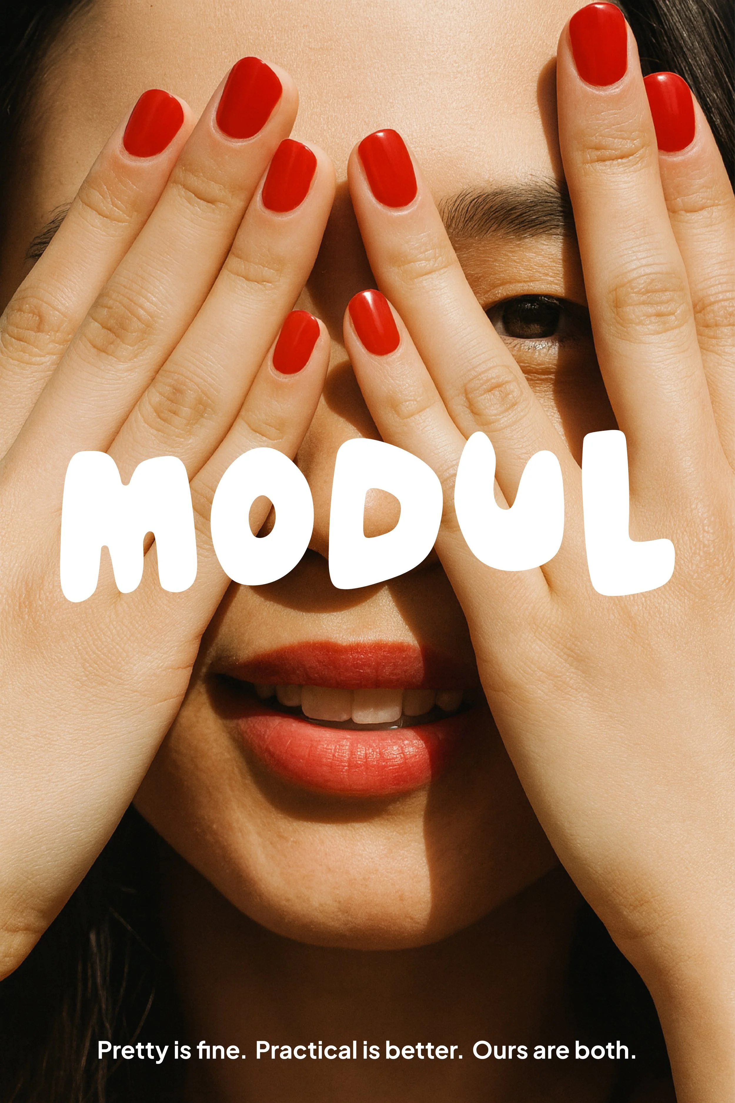
Tone: Confident, clever, approachable.
Key Lines: “Clip on. Clip off. Change it up.” / “Short for spreadsheets, long for cocktails.”
Rules: Function over fluff, always show product-in-action, empower the wearer, avoid beauty clichés.
Customer & Positioning
Target: 22–40, style-conscious professionals in urban centers, balancing practicality and self-expression.
White Space: Positioned between high-fashion but rigid nails and cheap but static press-ons. Modul fills the gap with adaptable, reusable beauty tech
-
Modul is proof that innovation + psychology = category creation. By pairing groundbreaking product design with Shade-driven strategy, Modul doesn’t just sell nails—it empowers people with a system of self-expression that adapts to every part of their lives.