MUTATE
Some brands are born to fit in. Mutate was built to change form. In a market where agencies sell templates and call them strategies, Mutate had to embody the opposite: adaptability as identity, transformation as its nature.
-
SEO agencies all promise the same thing—growth. But their brands rarely evolve; they calcify, trapped in sameness. Mutate needed a brand that refused stillness, one that lived in flux. The challenge wasn’t just to stand apart—it was to become the embodiment of change itself.
-
I work in patterns, and the pattern here was obvious: search is never static, so why should the brand be? Mutate couldn’t look like data on a spreadsheet—it needed to look like the future reshaping itself. Strategy became philosophy: a brand in constant metamorphosis, anchored not in what it is, but in what it is becoming.
-
Naming: The word “Mutate” carries weight—a single verb that promises evolution, not stasis.
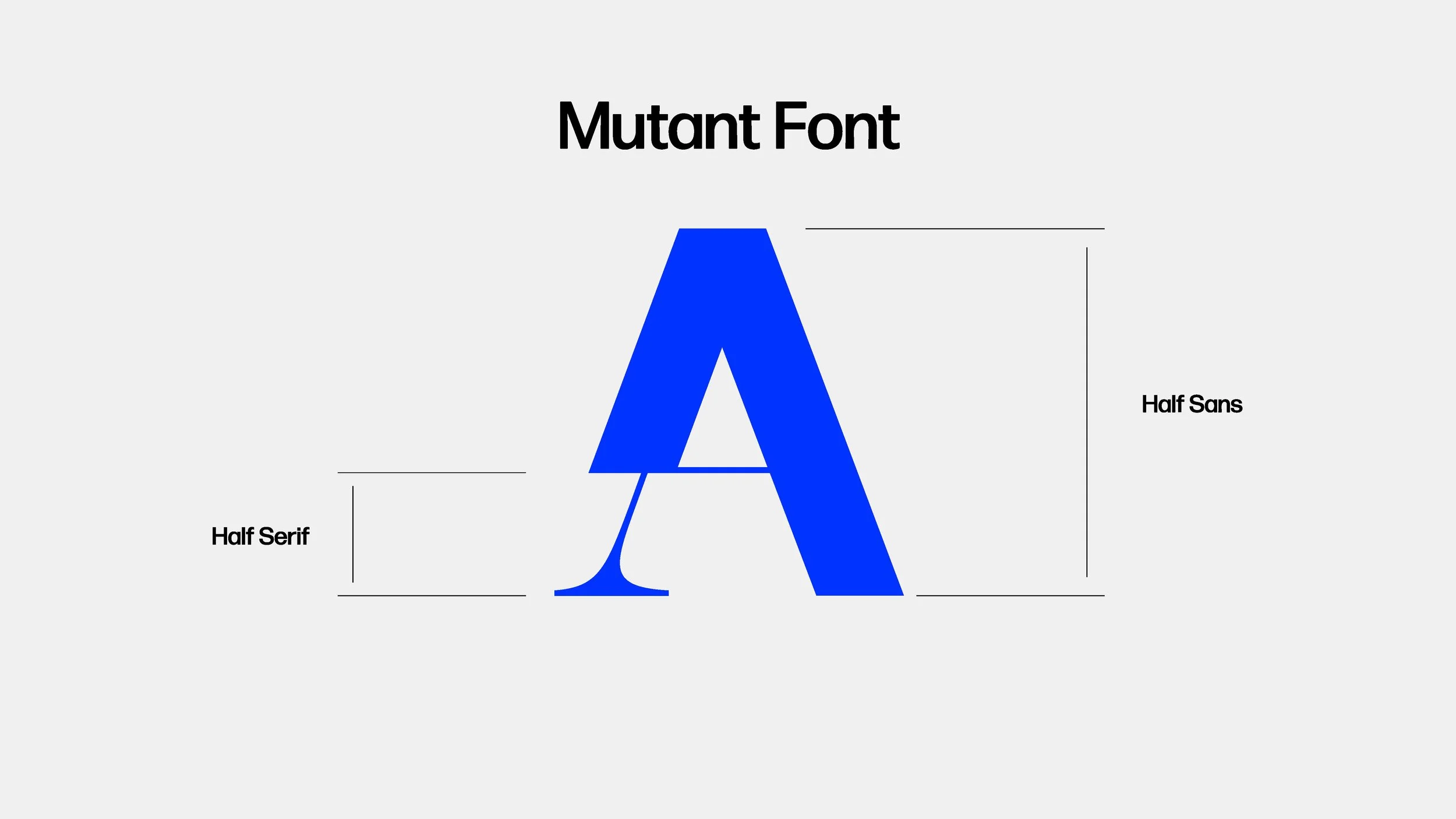
Custom Typeface: Designed as a hybrid of serif and sans serif, it shifts between worlds—old and new, structure and freedom. Even the letters themselves mutate, showing the agency’s ability to transform, shift, and mutate between forms.
Visual Identity: Sharp, minimal, alive—built to signal intelligence in motion.
Verbal Identity: No jargon, no filler. Language stripped bare, speaking with clarity and certainty.
System: A framework that scales across touchpoints while leaving room for evolution—because the brand had to be alive, not locked in a manual.
-
Mutate doesn’t blend into the sea of SEO brands—it slices through. It doesn’t promise change, it is change, visible in every line, every glyph, every word. Instead of looking like an agency chasing algorithms, Mutate looks like one rewriting them.
The Team
Raina Dayne
Brand Strategy | Naming & Verbal Identity | Customer Insight & Market Research | Creative Direction
Tulio Pinto
Visual Identity


